10 New Design Trend for 2018 that started in 2017
In the era of digital art, graphic design trends can evaporate as quickly as they emerged.It is the most creative area of digital design. Graphic design trends can evaporate as quickly as they appear. What you think is modern in the past few years may look completely outdated by 2018. While some trends have stood the test of time, others have vanished in the blink of an eye only to make room for new modern looks. Here are the design trends that we expect to take the throne in 2018 and you need to be ready for it .
Return of the 90’s (and 80’s)
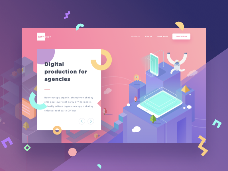
2017 was the year to bring back the 80s & 90s color palettes & patterns. Especially early 90’s American pop-influenced design. Though once it was hated but somehow it’s coming back and Following 2017, 2018 could see us more 80’s & 90’s pop designs, as well as grunge, earthy tones being used in creative ways.
The Glitch Efftect
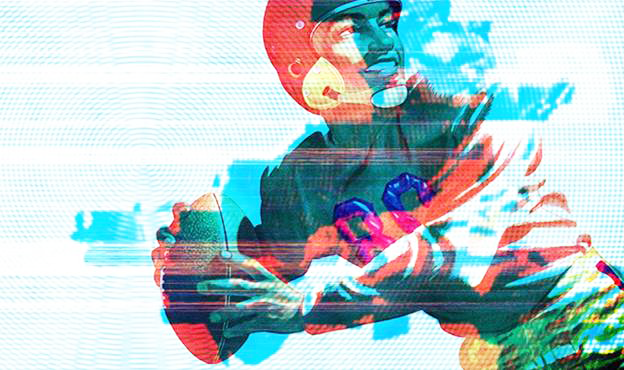
Broken image (flash effect), has been among the most popular trends in the digital world lately. The fans of horror movies might similar with these effects. However following 2017 last, broken images will be a graphics design trend in 2018 .
Double Exposure
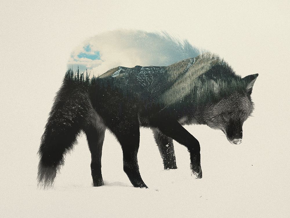
Double Exposure has existed for many years. The artist Andreas Lie was able to portray a wolf and the habitat he lives in the same picture (as I shown below).Some designers have put this technology aside for a while, Certainly, there’s seeing a lot of double exposure designs that are astonishing to the viewer.Double exposure is achieved by doubling the image or using two different overlapping images in monochrome. Double Exposure Duotone, Double Light also be with these saying goodbyes to the classic Duotone style.
Negative Space
This design technique is one of the most popular ones lately. It is, quite simply, the space that surrounds an object in an image. Just as important as that object itself, negative space helps to define the boundaries of positive space and brings balance to a composition. NBC Logo is one of the best example.
Artistic Illustrations
Custom hand-drawn illustrations are always on the wave of popularity. Each design is a work of art created with a lot of talent and imagination. This is why illustration has it’s own value & never become outdated.
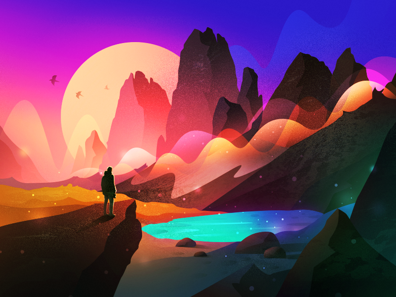
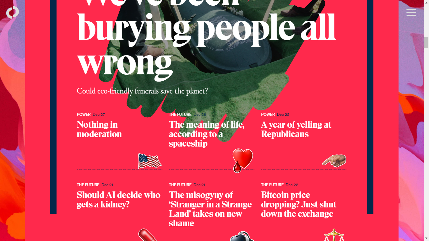
Bright Colour
It is also popular but in 2017 it has been growing & in 2018 it will become more because of technology where colours becoming stronger and more rebellious.

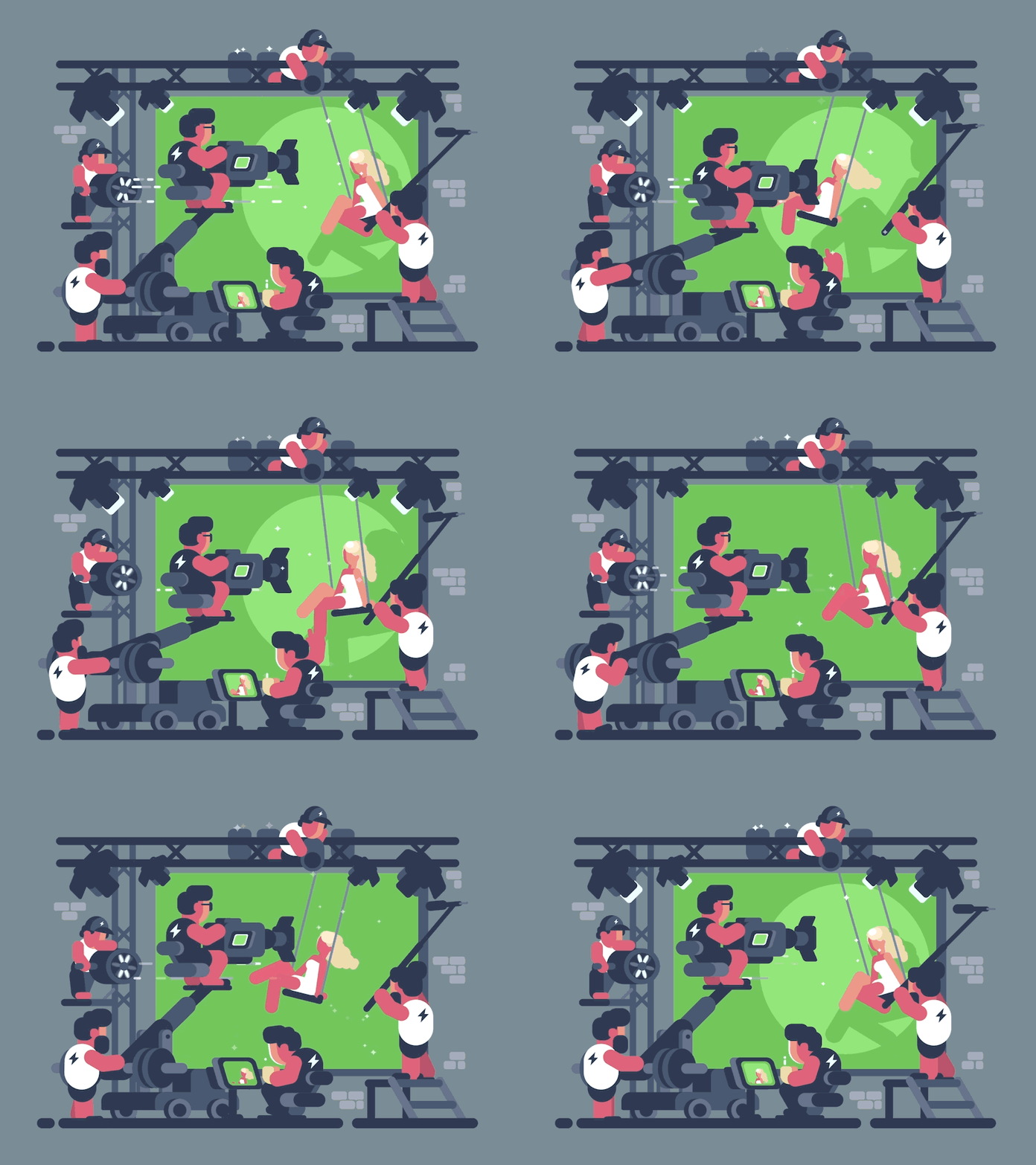
Animation (video) Everywhere
Simply put an image (video) with movement is always more attractive than a static one.And now most of the smartphones & tabs are compatible with flash player or like that to play the animation. In 2018 the uses of animation will increase undoubtedly.
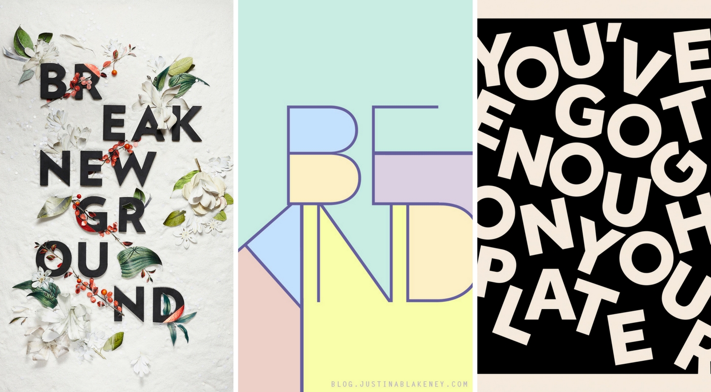
Typography
An element of design that has always been important to graphic design is typography. Choosing the right font, font size, font bold, and font spacing are key. In the new year, expect to see BIGGER, BOLDER and creative fonts.
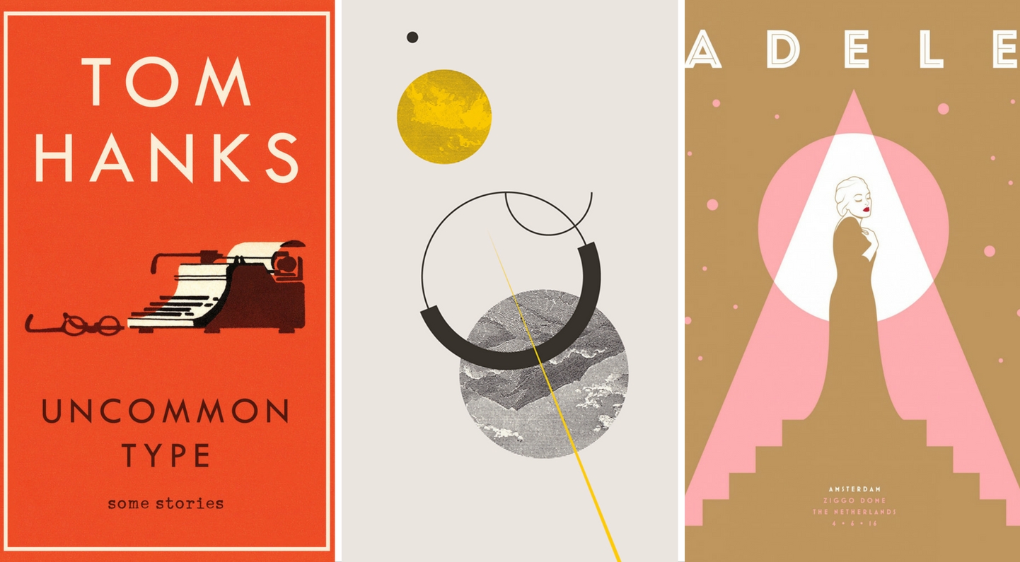
Revisit Minimalism
We all know minimalism is nothing new. It has been designers comfort zone but in 2018 we would see something new.
Brutalism
Though from my side I don’t like brutalism but it’s trending & in 2018 it will grow.
In short, the year 2018 will see designers experimenting with countless techniques and methods plus the ways in which to combine them creatively. Graphic design is not an easy task and if you haven’t designed before, it won’t be easy for you to incorporate all of the elements mentioned above. Start with the basics and begin to implement authentic visuals first, if you haven’t already done so. Remember, make your visuals STAND OUT!
The aim is to design something as unique and as original as possible. And the pro, always make yourself updated with new trends.
